Have you ever hesitated to get into men’s accessories?
Many men would like to spice up their outfit with a few accessories, but don’t know how to do it well. Accessories should add a little something to what you’re wearing, perhaps communicate something of your personality, but never overwhelm the outfit.
In a professional setting, it’s even more important to get it right when you’re accessorizing. Overdoing it or wearing accessories that aren’t appropriate for the environment will not send the right messages about you!
With that being said, don’t be afraid to experiment a little with a few quality accessories. Here are some do’s and don’ts to bear in mind when you do:
Men’s jewelry
There’s something about the word “jewelry” that seems to turn many men away. Contrary to what traditional stereotypes may hold, jewelry is not a feminine domain – there are plenty of options for the masculine male too.
As with any accessory, the trick is not to overdo the jewelry. It’s about a few well-chosen pieces that complement your own style and body type.
When wearing jewelry:
- Do choose items that are in proportion with your body. For example, longer necklaces on wider necks, wider watches or bigger rings on bigger wrists and hands, and smaller pieces of jewelry on smaller guys.
- Do choose the best pieces for your skin tone. How will you know? As a quick tip, cool skin tone shows blue or purple veins, warm skin tone shows green veins and neutral skin tone shows blue, green and purple veins.In general, light metals such as white gold, platinum or silver are best for cool skin tones. Warm skin tones are suited to yellow metals such as brass, rose gold or yellow gold, while neutral skin tones suit white and yellow metals.
- Do wear cufflinks with French cuffs. You could build a collection of them to complement your personality. Match them with other metals that you are wearing.
- Don’t over-accessorize. Too much jewelry is distracting and can throw an outfit off-balance. For example, if you’ve piled on three necklaces, this will focus the eye on the necklaces rather than the rest of the outfit. The same goes for having a lot of rings on one hand or multiple bracelets. You draw too much attention to one part of your body.
- Don’t forget to consider the setting you’re going into. Consider what is appropriate for that setting. For example, you don’t generally wear earrings while wearing a suit.
- Don’t mix your metals. If you’re wearing a two-toned watch, match any other accessories with whatever the dominant metal is.
Neckties
Ties are the most commonly worn accessory in the professional world, and really help to take an outfit from business casual to more formal. Of course, this hinges on you making the right necktie choices…
- Do ensure that the tip of your tie touches your belt line. You don’t want to go any higher or any lower.
- Do experiment with different knotting styles and choose one that complements your shirt collar. If you’re unsure, the Windsor Knot tends to be one of the most versatile.
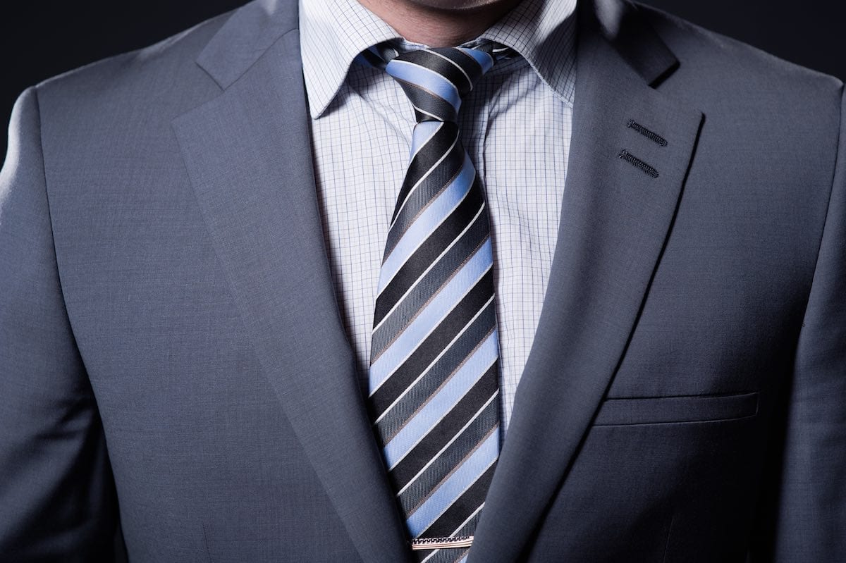
- Do experiment with patterns, as long as you select a tie in a complementary color. For example, sometimes a shirt with small checks can be paired well with a tie that has large checks. See another example in the picture below.
- Don’t opt for novelty ties for formal occasions.
- Don’t let the thin part of the tie tail flap around. Keep it shorter than the front part, but if you just can’t get that to work, tucking it inside your shirt is an option in a pinch.
Belts, braces and suspenders
First of all, there is a difference between braces and suspenders, although Americans tend to use the term “suspenders” most of the time, while the British tend to use the term “braces.”
Fashion purists will argue that the term braces refers to the type of suspender with a buttonhole tab that attaches to the buttons on the inside of your dress trousers. On the other hand, suspenders are argued to be the kind with the metal clip that fastens to the top of your trousers.
There are arguments back and forth over which is more appropriate in a professional setting, with many suggesting that the buttonhole type demonstrates more attention to detail and a preference for higher-end accessories. Buttonholes are seen as a deliberate fashion choice, while clip-ons are donned more casually and are available through mass-produced stores everywhere.
Whichever you prefer, there is one big don’t… NEVER wear suspenders and a belt together. Their utility becomes redundant and can look silly.
Here are a few more do’s and don’ts:
- Do have at least two good-quality leather dress belts; black and brown are good choices.
- Do match your belt color to your dress shoes.
- Do choose suspenders/braces that either match or complement the rest of your outfit. Leather suspenders should be a match for your dress shoes.
- Do (on the other hand) look at suspenders that might brighten up an outfit for occasions outside of the work setting. For example, brightly colored suspenders can look great with a black and white wedding tuxedo ensemble.
- Do understand that suspender width tends to follow similar rules to ties. The skinnier the suspender the more casual the look.
- Don’t wear a casual belt with a business suit.
- Don’t go for cheap looking suspenders that might be found holding up a clown’s outfit. Small clips tend to be better-looking.
Pocket squares
Pocket squares have seen something of a re-emergence over the last few years. It used to be a fashion accessory for dinner parties and other formal engagements, but has also turned up as part of business formalwear.
There isn’t really any occasion not to wear a pocket square as part of your formal attire — just remember it’s for show. A pocket square is not the same as a handkerchief!

Here are some pocket square do’s and don’ts:
- Do choose a pocket square fabric that harmonizes with or contrasts nicely with your other accessories. Don’t match the pocket square with your tie — while some companies sell matching tie and pocket square sets, it’s a better look if the pocket square complements rather than matches. For example, you might have a plain tie but choose a patterned pocket square with a secondary color that matches the tie.
- Do pay attention to size. This matters in terms of whether the square will sit nicely, showing from your pocket or whether it will slip down. In finer fabrics such as silks, choose a square that measures 16 inches or more per side. Thicker fabrics such as tweed will need to be smaller to fit properly in the pocket.
- Do match your fold to the occasion (that’s right, there are different types of pocket square folds!). A flatter fold tends to be better for formal occasions, whereas something with more flair such as a puff fold can suit more casual occasions.
- Don’t overdo colors and patterns. Just like tie choice, you want to aim for classy rather than novelty.
- Don’t blow your nose on it! That’s not what it’s there for.
One last “rule” is fairly universal; white pocket squares go with everything. They can be worn be worn with every jacket and tie combination and color. You could consider the white pocket square as a fail-safe — you won’t get it wrong!
Final thoughts
Coco Chanel had a guiding principle that works well for men’s accessories as well: “Before you leave the house, look in the mirror and take one thing off.”
The idea is to keep it simple — those that are more understated tend to come off as more stylish and professional. You’re looking for accessories that complement what you’re wearing, rather than those which are distracting or make you look “tricked out.”
Accessories help you to add some personality and flair, but they can also send messages that you weren’t intending. Aim to strike the right balance between subtlety and ostentatiousness.